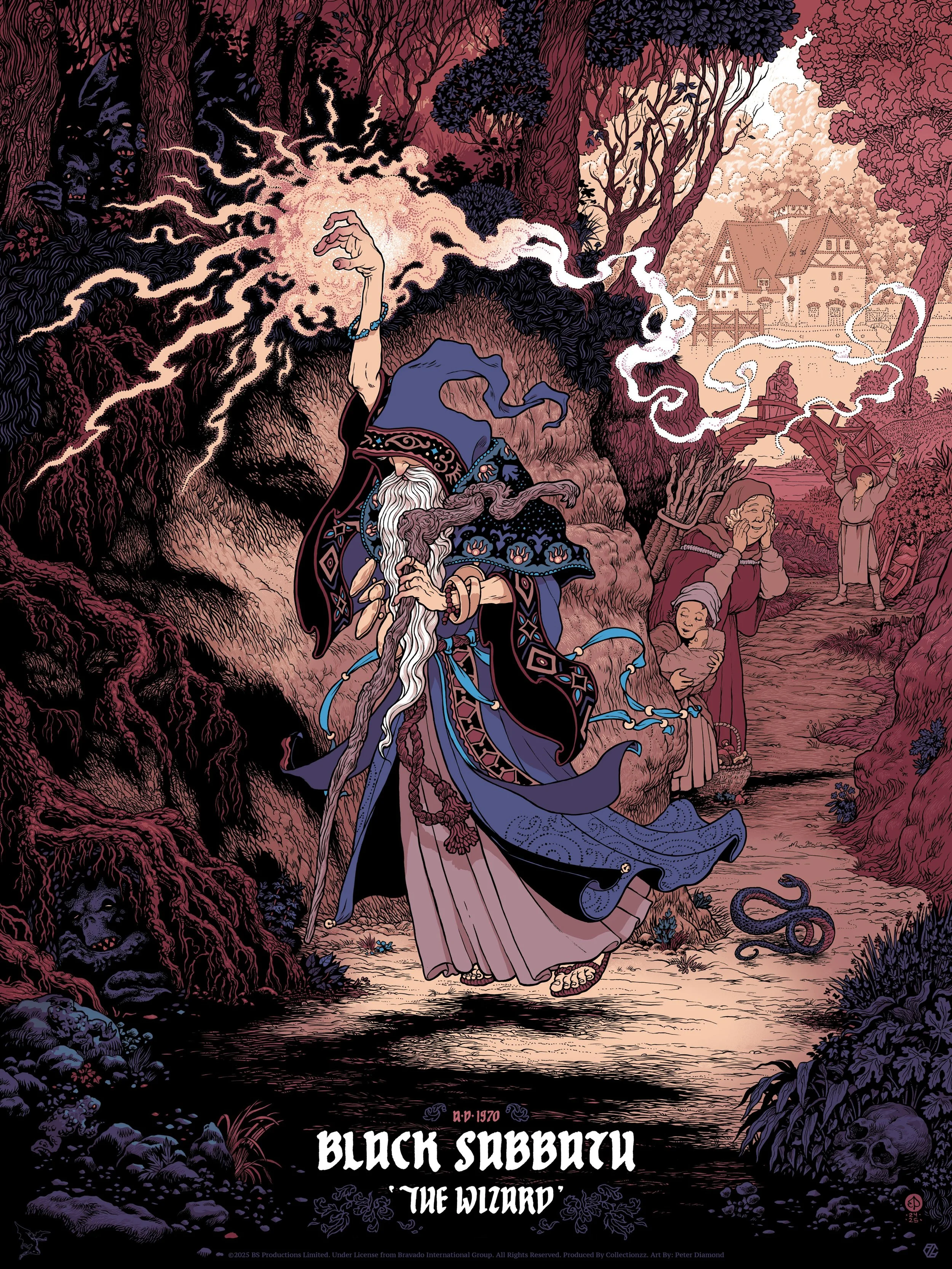
My official screen print commemorating Black Sabbath’s ‘The Wizard’ comes out today through www.collectionzz.com.
I’ve been a fan of Black Sabbath for the last 30 years or so, since a couple of friends came to my house with some mind-blowing CDs. One of those same friends lent me a book of Black Sabbath guitar tablature, and what I learned from it still shapes the way I play the instrument today.
Put most succinctly, this piece is a love letter to my favourite band. But there’s more to tell than just that.
Dark vs Light
I’ve long felt that one of the secrets to Sabbath’s staying power over the decades is that, while inventing heavy metal by making darkness and fear the cornerstone of their sound, lyrically they never handled those themes in a one-dimensional way. They always understood darkness in relation to light. Tony Iommi has said as much in describing the lighter interludes and passages in their songs, and it’s evident in Geezer’s lyrics as well. Dark powers are always front and centre, but the lyrics don’t lionise or sympathise with evil. Quite the opposite, they are always something to be overcome.
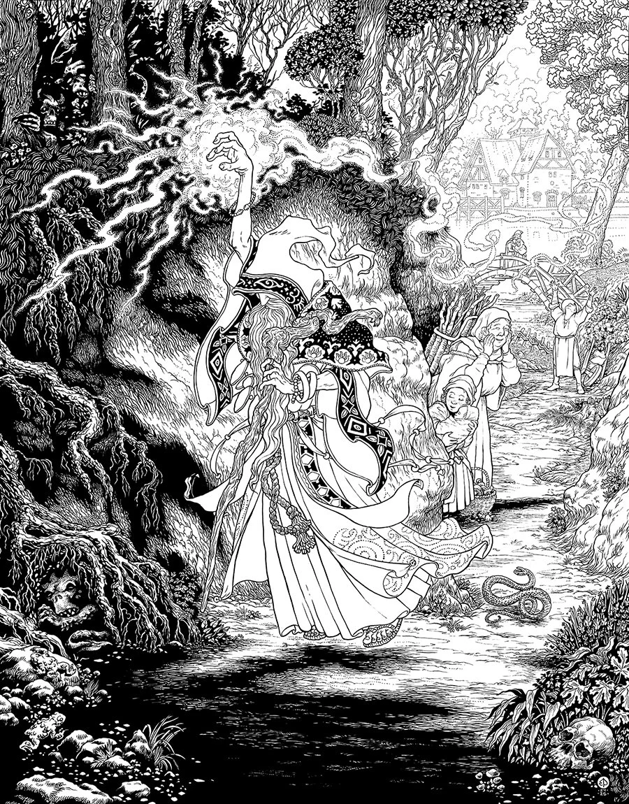
Geezer Butler’s lyrics can be wonderfully abstract, but in ‘The Wizard’ there is a very clear narrative. ‘The Wizard’s’ first verse sets scene of the song, and is almost enough on its own for an illustrator to work from:
Misty morning, clouds in the sky
Without warning, the wizard walks by
Casting his shadow, weaving his spell
Long grey cloak, tinkling bell
But the heart of the song, and the guiding concept for my image, is in the second verse:
Evil power disappears
Demons worry when the wizard is near
He turns tears into joy
Everyone’s happy when the wizard walks by
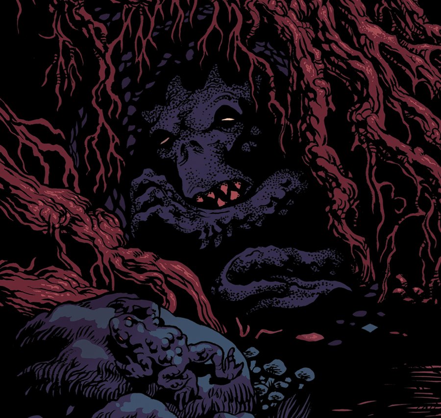
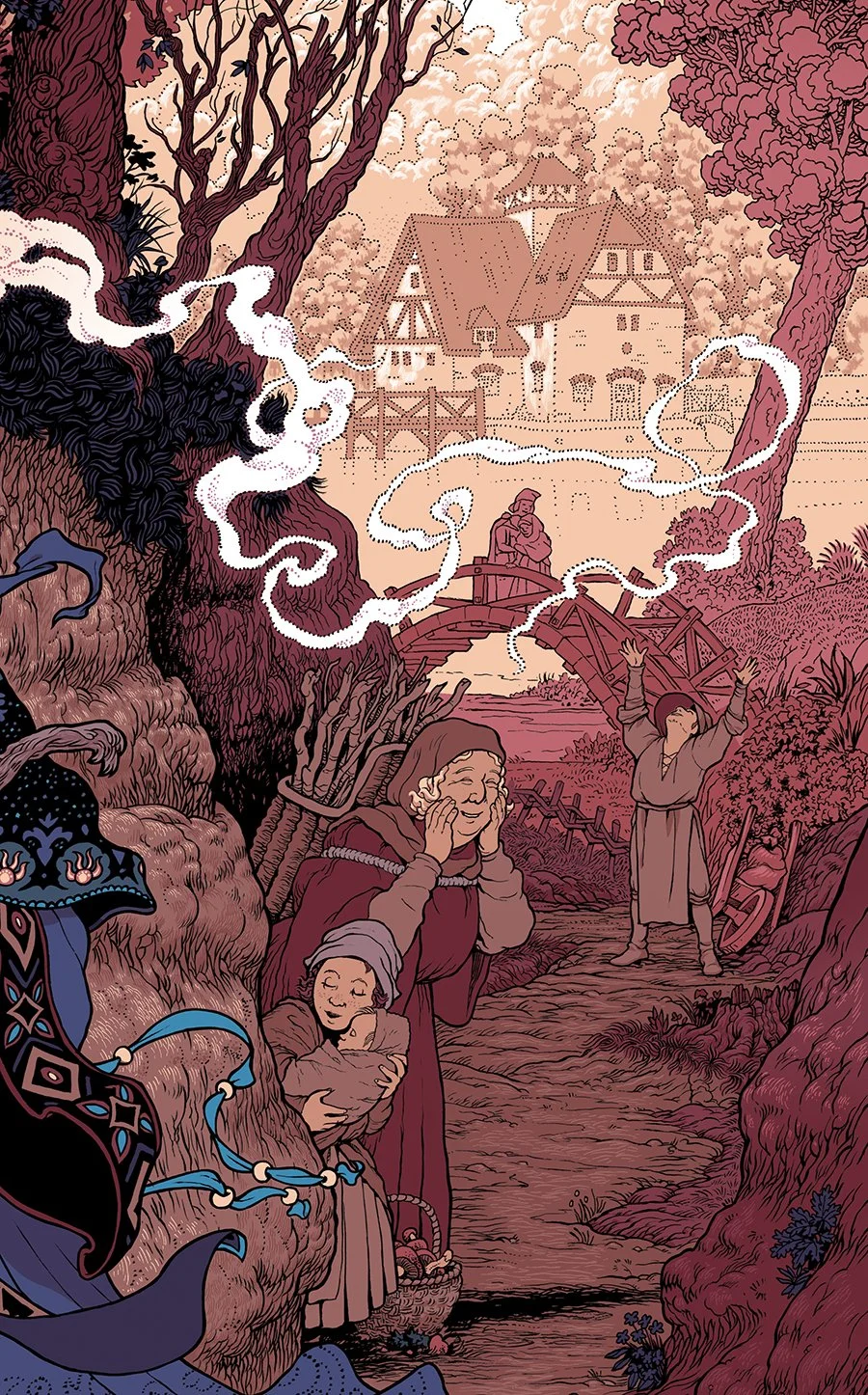
The demons of that second verse cower behind the trees and under the roots as the wizard advances towards them, and in the middle ground and background is the brighter world he leaves behind:
Sun is shining, clouds have gone by
All the people give a happy sigh
He has passed by, giving his sign
Left all the people feeling so fine
Geezer’s lyric’s are so clear, visually and thematically, that he practically planned the image for me. And the band’s overarching theme of Light vs Dark guided the design design to play massive black areas in the foreground against very sparse inking in the background.
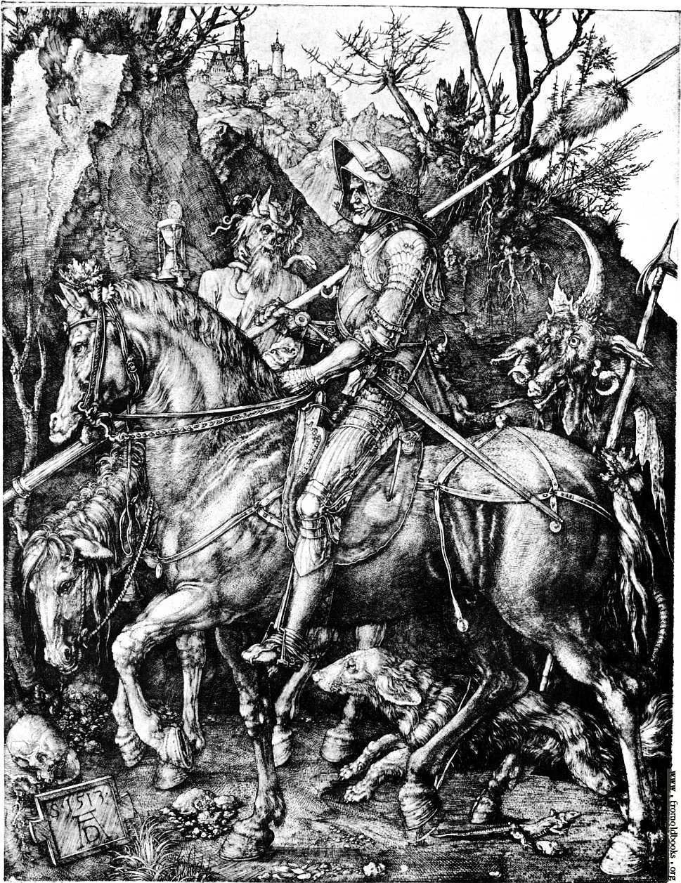
That heavy inking and extreme value scale, combined with the implicitly medieval setting (Geezer has said his wizard was inspired by Tolkien’s Gandalf the Grey), and perhaps due to what I’d been looking at recently, steered me toward’s Albrecht Dürer’s ‘Knight, Death and the Devil’. My image may not look much like it on the whole, but that famous etching is where my arrangement of the elements and figures comes from. The tree-covered embankment behind the character, the distant building, and the procession of characters are all inspired by Dürer’s masterpiece.
Easter Eggs
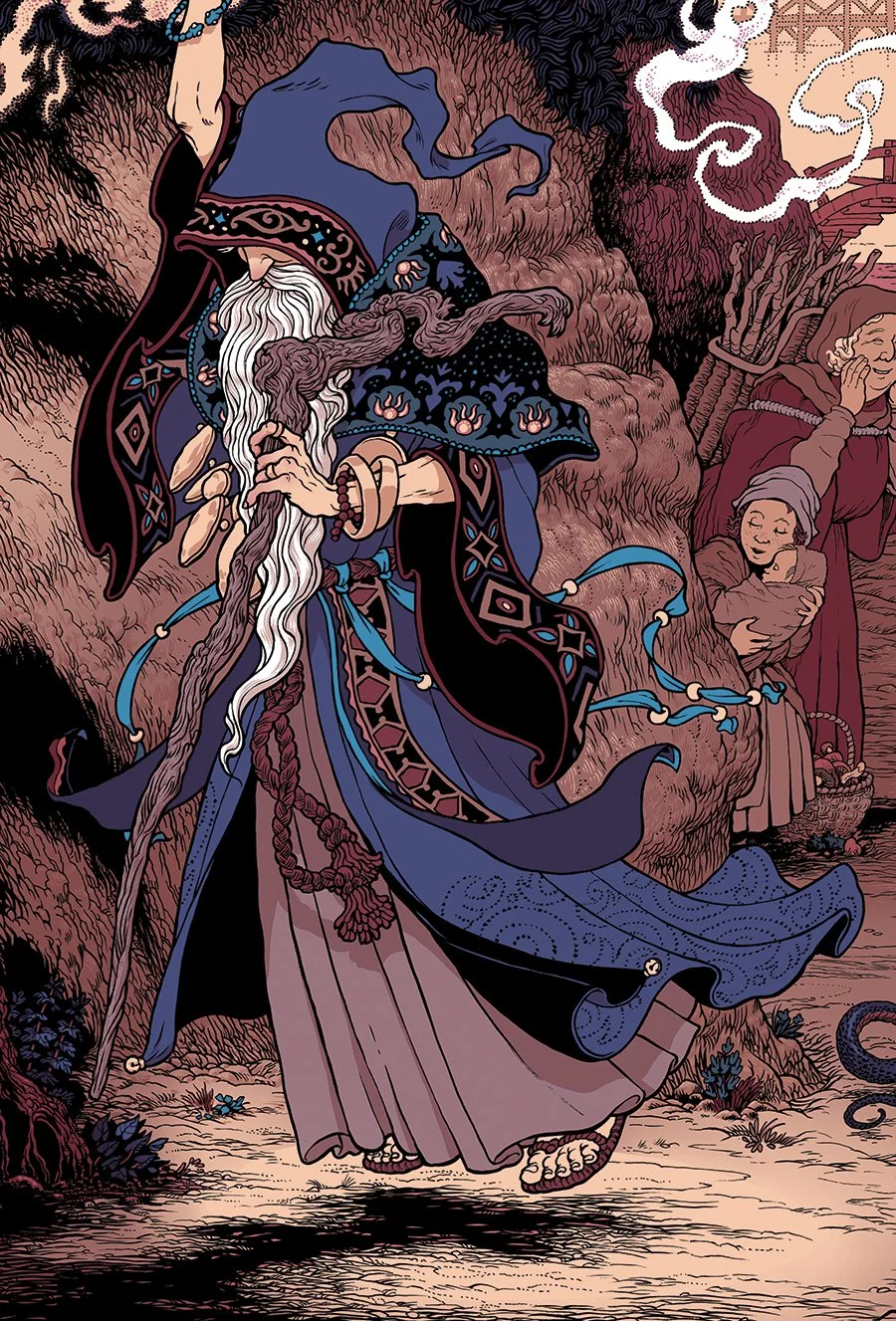
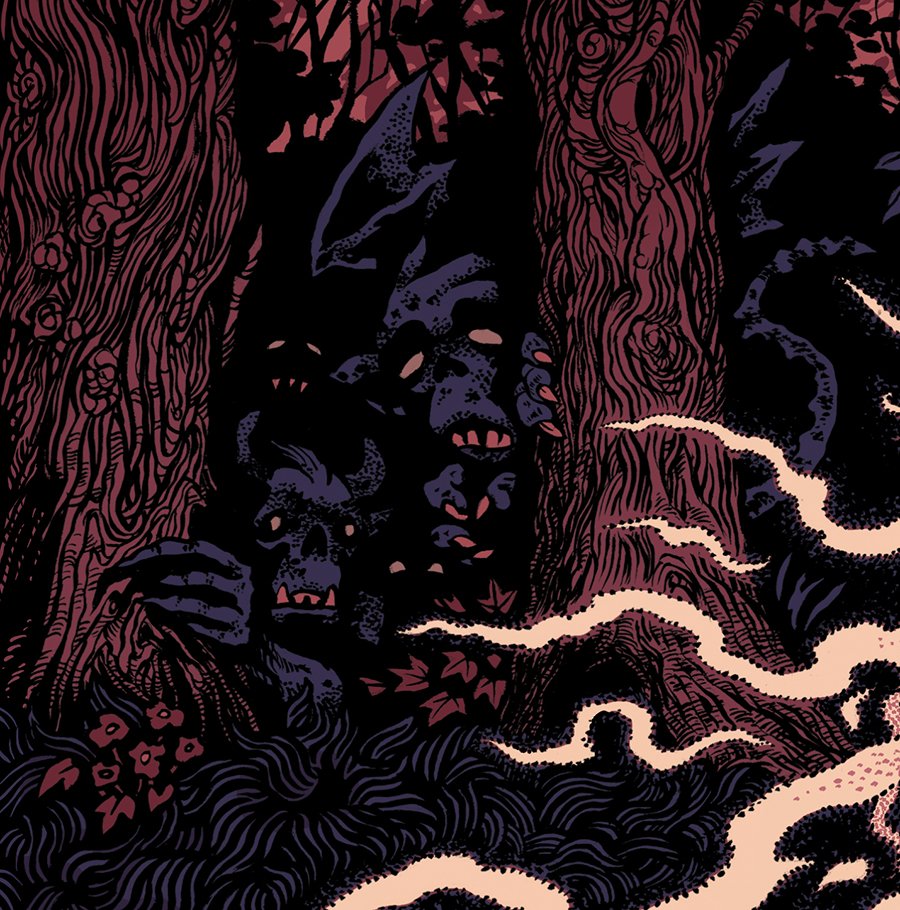
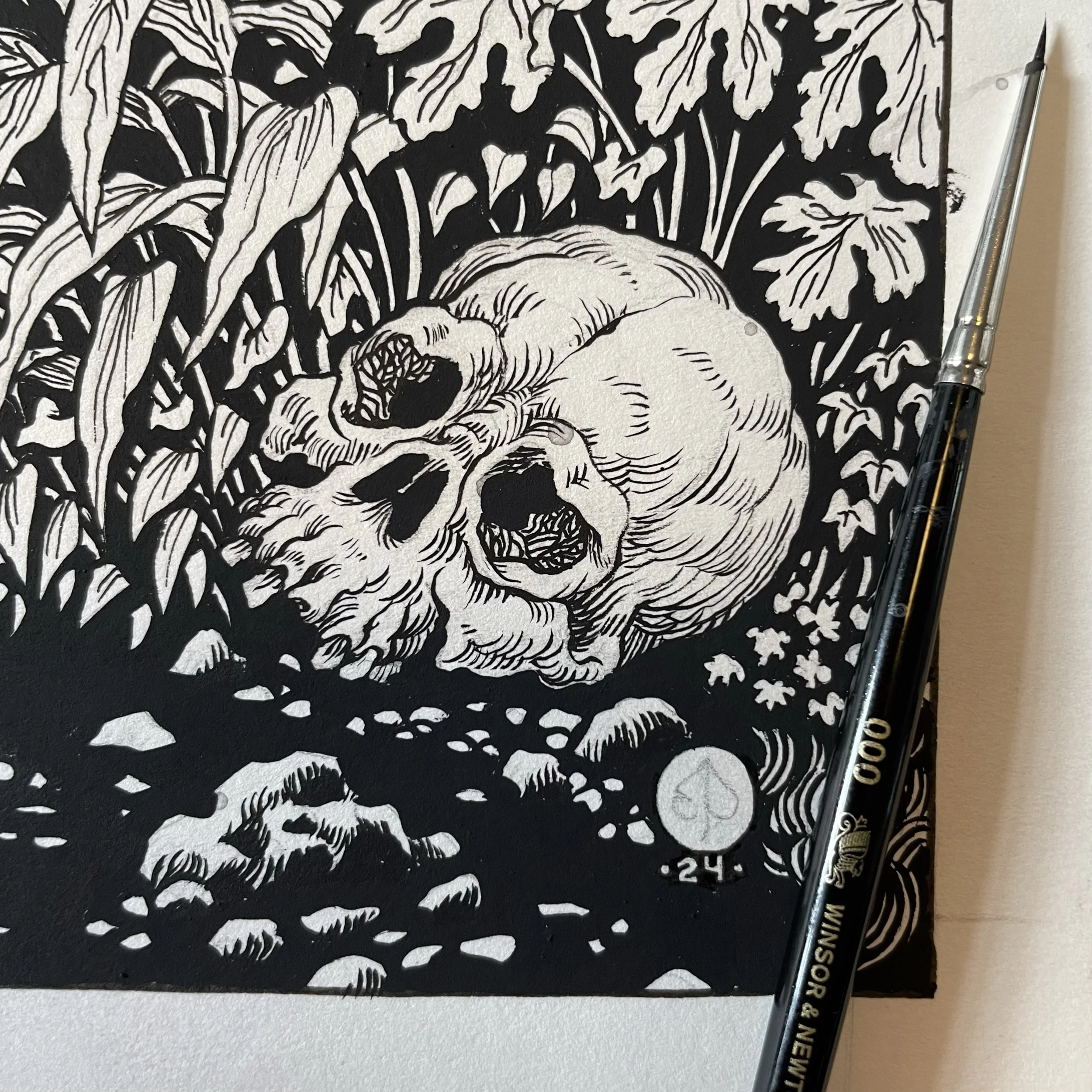
As a nod to Dürer, I’ve included a skull in the right bottom corner, rendered in a lumpy style often found in his drawings. It’s one of a few such small references, ‘easter eggs’ you might say, that I spread thorough the design. The demons of course are clear, and the happy peasants, but there are some less obvious ones as well.
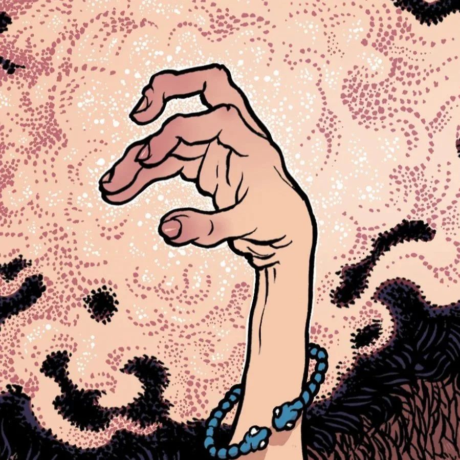
The wizard’s hand position, with which he’s casting his spell, forms the grip for fretting a power chord on the guitar. The index finger frets the root note while the ring finger frets the perfect fifth. The perfect fifth dyad or “power chord” is familiar to all rock guitarists and is a cornerstone of Iommi’s style. My wizard forms it with his right hand as Iommi would. I don’t know if Tony is also inclined to use the pinky finger to fret the octave as well, but it’s what I do and so my wizard does it too.
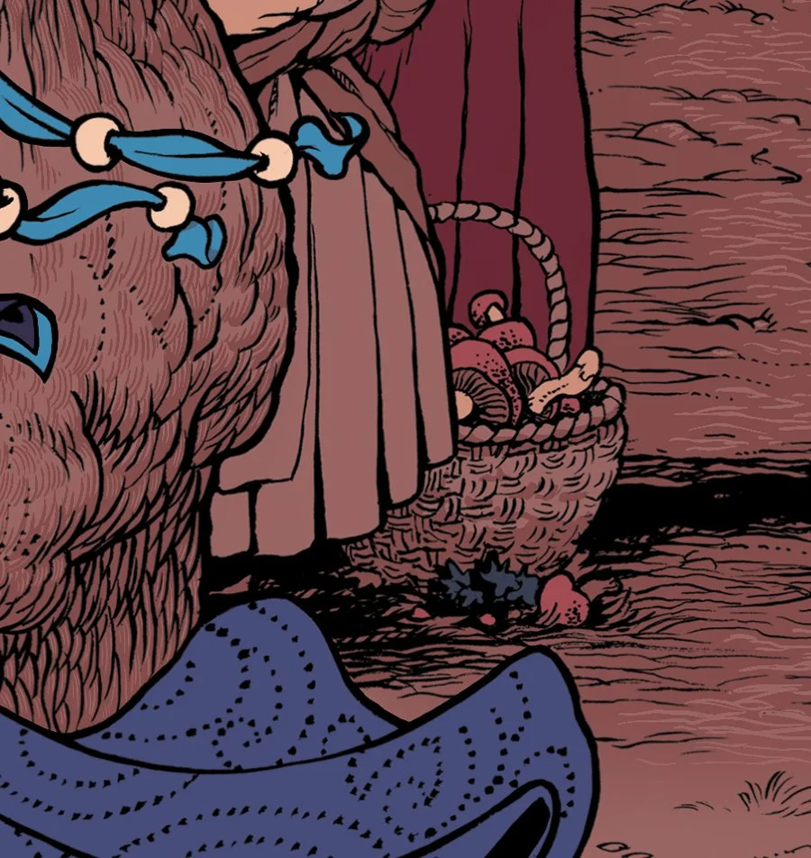
The old woman and little girl are gathering mushrooms. One interpretation of the lyrics is that they’re a metaphor for a drug dealer, and it’s in recognition of that idea and Sabbath’s general psychedelic vibe that these two are foraging fungi and not something else.
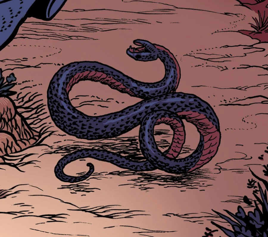
The serpent, long a symbol of Satan for many, is thrashing in pain. I’m fascinated by the blowback Sabbath got for years from people who thought they were Satanists, when their music is so clearly opposed to the evil forces it deals with.
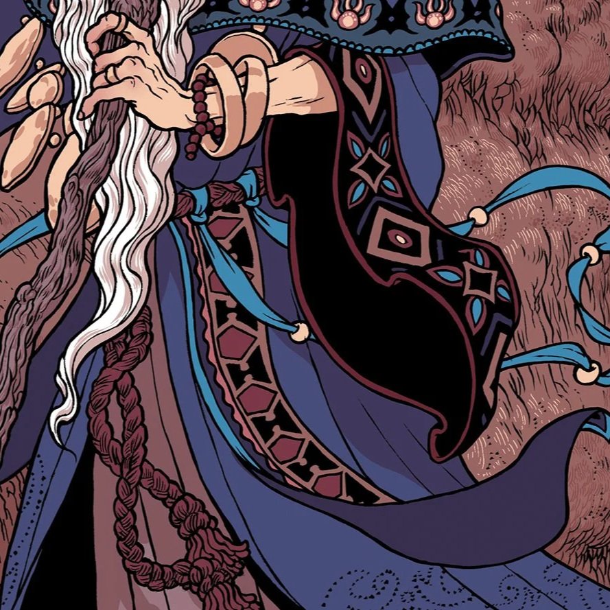
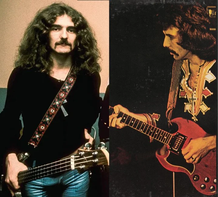
On the wizard’s clothing, two patterns appear which are taken directly from old photography of the band. One is from a guitar strap Butler wore, and the other is from the embroidery on a shirt Iommi wears in the album photography from Vol. 4
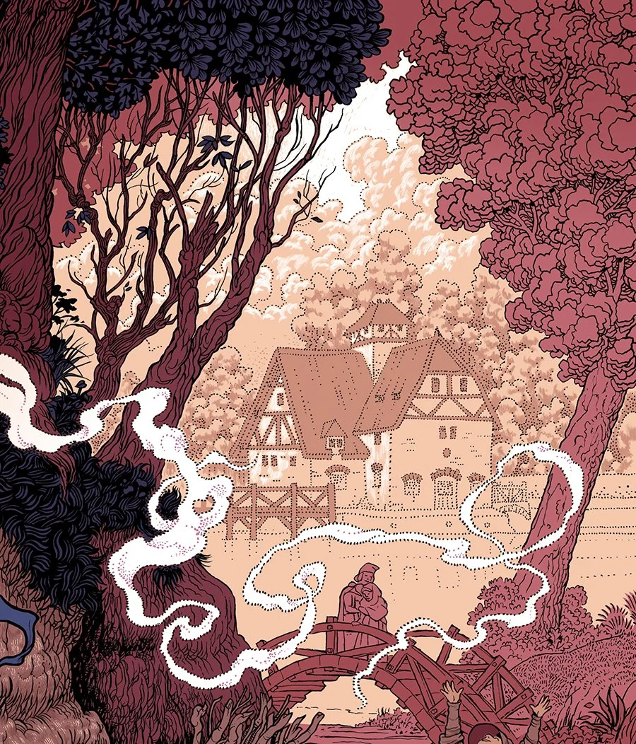
Finally, the Mapledurham water mill is familiar to all Sabbath fans, appearing prominently on the debut album’s front cover. I knew from the first that this building had to be on the cover, and while I doubt the approach to the mill’s location every looked quite like it does in my drawing, I like to imagine this scene occurring on some ancient version of Mapledurham Road, maybe where St. Margaret’s Church is today.
Colours
Once all of this was planned out, it was a matter of choosing my colours. I decided to aim for something reminiscent of the album cover’s weird scheme of faded reds, purples, and earth tones. As I worked I discovered that the palette which best served to flesh this out was one drawn from the colour schemes of the first five Sabbath records, which I regard as the best consecutive run of rock albums I’ve ever heard. Paranoid’s pink and blue, Master of Reality’s purple, Vol. 4’s yellow, and the pink/yellow combination from Sabbath Bloody Sabbath. And of course black. Lots of black.
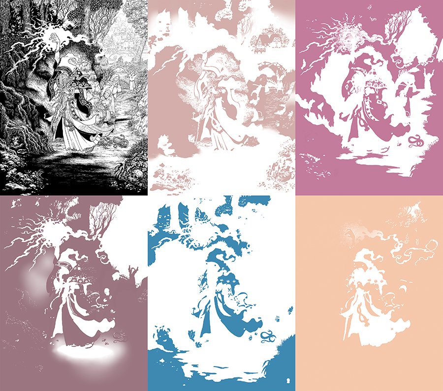
The final screen prints were made by Baker Prints in six layers: